Color and type are not decoration, they are communication, and they send a message about your business before anyone reads a single word.
You open a company's website and within less than a second you feel whether you like it or not. That feeling is not random. Behind it sits a visual identity, a set of aesthetic decisions that communicate who the company is, how trustworthy it is and who it is for. The color palette, typography, spacing, photography style, all of it together sends a clear message before you read a word about the service or price. If your visual identity does not represent you well, you are losing customers you will never see, because they left on first impression.
Why visual identity is not just aesthetics
Visual identity is strategy expressed visually. When you choose colors, you are not just choosing what you like. You are choosing what emotions you want to trigger, who you are talking to and what kind of trust you want to build. Blue is associated with reliability and expertise, which is why it is so popular in finance and technology. Green speaks of health and nature. Red excites and creates urgency, but it must be used carefully.
Typography does the same work. Serif fonts, those with small extensions at the ends of letters, feel traditional, serious and trustworthy. Law firms and financial advisors use them for a reason. Sans-serif fonts look modern, clean and digital. Script fonts are personal and warm but harder to read at small sizes. When you choose a font, you choose a character.
Color psychology: what each color communicates
Research on color psychology has existed for decades, but it should be used as a guide, not a dogma. Context, culture and color combinations always modulate meaning. Still, some general rules persist because they are confirmed in practice over and over.
Blue tones increase feelings of trust and competence, which is no accident in banks, hospitals and tech. Orange and yellow are optimistic and attention-grabbing, and an energetic call-to-action button in orange often outperforms the same button in grey. Black and gold communicate luxury and exclusivity. White gives space, cleanliness and focus.
- Blue: trust, expertise, stability. Ideal for finance, healthcare, technology
- Orange and yellow: energy, optimism, urgency. Great for CTAs and youth-facing brands
- Green: growth, health, nature. Popular for organic brands, fintech, environmental causes
- Black and gold: luxury, premium, exclusivity. Use carefully so it does not feel heavy
A visual identity is a brand's signature, and like any signature, it must be yours and instantly recognizable.
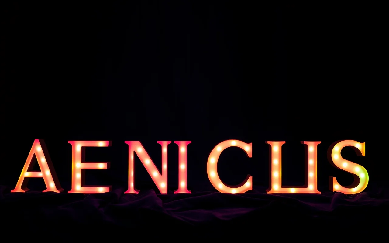
Typography that communicates without words
Typography is one of the most powerful yet most undervalued components of visual identity. Even when you are not reading the text, the form of the letters leaves an impression. A solid, geometric typeface signals precision and modernity. Variable, calligraphic letterforms speak of creativity and freedom. Tightly packed letters with tight spacing feel aggressive or compact, depending on the context.
The recommendation is to never use more than two, maximum three fonts in a single identity. One for headlines, one for body text, optionally a third for accents. More than that and the site starts to look cluttered. Consistency in typography, using the same fonts across all materials, builds brand recognition over time.
A color system, not just a palette
A color palette is a list; a color system is rules for use. Which color is the primary brand color? Which is the accent color for calls to action? Which color works on dark backgrounds and which on light? Which combinations are off-limits? These rules prevent visual chaos when multiple people work on materials.
A good visual system also defines neutral colors: varying shades of white, grey or cream that form the background against which the primary colors can shine. Without good neutral colors, a palette easily becomes oversaturated and tiring to the eye.
Consistency is what turns visuals into a brand
You can have the most beautiful logo in the world, but if you use one font on your website, another in your newsletter and a third on Instagram, you do not have a brand. Branding is created through the consistent repetition of the same visual system across all touchpoints over a long enough period.
The practical tool for this is a brand book or style guide, a document that defines all visual standards: logos in all variants, color palettes with HEX and RGB codes, fonts with size and spacing rules, guidelines for photos and illustrations. When this exists, even a freelancer making an ad for you will not get it visually wrong.
- Define primary and secondary colors with exact codes, not descriptions
- Specify fonts and their sizes for headlines, subheadings and body text
- Include examples of correct and incorrect logo use to prevent common mistakes
When it is time to refresh your visual identity
Visual identity is not eternal. Markets change, audiences change, aesthetic standards evolve. A company that looked modern in 2010 can look dated in 2026. A refresh is not the same as a complete redesign; often it is enough to update the palette, change a font or modernize the logo while keeping recognizable elements.
Signals that it is time for a refresh include a feeling that your visuals no longer reflect who you are, customer comments about looking outdated, or a clear gap between your visuals and those of successful competitors in your niche. Changing a visual identity is serious and requires a plan, but when done well it can dramatically lift brand perception.
At izreklamiraj.me we create visual identities with strategy behind every pixel. From color palettes to typographic systems and brand books the whole team can use, we build identities that communicate the right message to the right audience. If your visual identity is not working hard enough for you, come in for a free consultation at izreklamiraj.me.